Photophobia is a complex disorder that can involve aversion not simply to bright light but to spatial patterns, colour and flicker.1 It is common in neurological diseases that involve the visual system,2 of which migraine is the most prevalent.
Tinted lenses have been widely advocated on the internet as a means of reducing photophobia, particularly in migraine, and the FL41 tint is prominently advertised. The tint was designed over 20 years ago by Wilkins and Wilkinson to reduce flicker from fluorescent lighting.3 At that time, fluorescent lamps were controlled by a magnetic ballast that provided two gas discharges with every cycle of the alternating current electricity supply, 100 or 120 times per second. The gas discharges provided a mixture of blue light and ultraviolet light, and a halophosphate coating on the inner surface of the tube converted the ultraviolet light to long-wavelength (orange) light. The phosphor continued to glow between gas discharges, so the lamp varied continually from bright white to dim orange. This flicker was usually too rapid to be consciously perceived; however, in 1989, it was shown to cause headache,4 thus explaining the aversion to fluorescent lighting hitherto often expressed by people with migraine. The flicker could be reduced by about one-third when the FL41 tint was worn because the tint attenuated the short-wavelength light due to the gas discharge, reducing the continuous variation in brightness and colour.3
Good et al. used the FL41 tint with school children and compared it with a blue tint, which was less effective at reducing headaches.5 The reason for the reduction in headaches was most probably the school lighting, which would then have used halophosphate fluorescent lamps operated from magnetic circuitry.6 Halophosphate lamps have largely been replaced by ones with more efficient phosphors. More importantly, the lamps are now usually controlled by an electronic ballast that increases the flicker frequency into the kilohertz range. The original rationale for the FL41 tint has, therefore, largely disappeared, although the FL41 continues to be marketed. The tint has been re-designed by Dr Bradley Katz (University of Utah, Salt Lake City, UT, USA) and there are now two types of coloured lenses available on the internet, both described as FL41: the original, a light orange, and the more recent one, a moderate pink. A different rationale for the tint has briefly emerged. In 2010, Noseda et al. linked photophobia to the intrinsically photosensitive retinal ganglion cells (ipRGCs), which are most sensitive to the short-wavelength light attenuated by the tint.7 However, subsequent work has shown that photophobia is not the result of the stimulation of any one class of photoreceptors.1
Notwithstanding the advent and demise of rationales for the use of tints to prevent photophobia, aversion to bright light has now been shown to depend upon its colour. The aversion to narrow-band blue, green, amber and red light has been explored in two studies during the headache phase of migraine and interictally.8,9 The patients were dark adapted for 3 minutes, and the light intensity was increased in steps from mesopic (1 cd/m2) to photopic (100 cd/m2). Although the results have been widely interpreted as demonstrating that green light is less aversive, such an interpretation is complicated by the fact that the light energy was equated in terms of its photopic luminance, which was not appropriate for equating the brightness at the mesopic levels used initially. Green light (530 nm) is captured with similar relative efficiency at scotopic and photopic light levels, whereas red and amber lights require more energy at mesopic levels, and blue light requires less energy. This difference in the initial apparent brightness of the lights may have affected the associated ratings of aversion and, therefore, complicates any inference as to colour preference.
An alternative approach to the study of colour and photophobia is to consider the possibility that different individuals may benefit from different tints because of individual variations in cortical pathophysiology. It is this approach that is reviewed in the current article.
The Intuitive Colorimeter™ (Cerium Visual Technologies Ltd, Tenterden, UK) (Figure 1A) is a device that illuminates a visual stimulus (usually text) with coloured light.10,11 The hue (colour) and saturation (strength of colour) of the light can be varied independently without changing luminance. The hue is shown as spokes and the saturation as concentric rings in Figure 1B. Chromaticity is a metric combining these two values within a Euclidean space. The chromaticity of conventional sources of lighting is close to a curved line that shows the Planckian locus. (The Planckian locus shows the colours created when a ‘black body’ is heated, glowing red hot, white hot and, eventually, blue as temperature increases. The ‘colour temperature’ is used to characterize the colour of conventional light sources.)
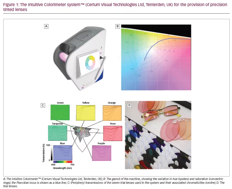
During an assessment with the instrument, a simple algorithm is used to enable patients to select a chromaticity of light at which visual comfort is maximal under conditions that allow for colour adaptation. As will be shown, the chromaticities chosen by healthy individuals tend to cluster along the Planckian locus (Figure 1B). This is not the case in individuals who experience photophobia, some of whom choose strongly saturated coloured light.
The studies reviewed in this article used the Intuitive Colorimeter. Having found an optimal chromaticity for each participant, spectacle lenses were tinted so that, when the spectacles were worn, the chosen chromaticity was experienced under conventional white lighting.12 The tint typically used just two dyes (neighbours in Figure 1C). In cases of severe photophobia, a third grey dye was added to reduce transmission.
The system has been used in the following neurological disorders: photosensitive epilepsy, autism, migraine, cluster headache, visual snow, stroke, multiple sclerosis and concussion. While the evidence regarding these topics is preliminary and indicative rather than conclusive, the effects of coloured filters may help to elucidate the mechanisms underlying the apparent benefit from colour and, in particular, the role of colour in reducing the neurological effects of any cortical hyperexcitability.
The following review includes all the studies that have used the Intuitive Colorimeter in neurological diseases, sourced from Google Scholar using ‘Intuitive Colorimeter’ as a search term, together with other studies known to the authors. Studies in which patients chose the best coloured filter from a large range are also included for comparison where appropriate. Studies of the Intuitive Colorimeter in individuals with dyslexia have been reviewed elsewhere13 and are not discussed here.
Photosensitive epilepsy
Photosensitive epilepsy is a condition in which seizures are provoked by flickering light. It is usually diagnosed with the help of the electroencephalogram (EEG), which shows a particular configuration of waveforms, known as a photoparoxysmal response, when the patient is exposed to flickering light. Over the years, many studies have investigated the effect of the colour of the light in provoking this response. In their review, Harding and Jeavons cite 17 studies, some showing greater effects of red light, and some showing little difference between the light of various colours when brightness is controlled.14 The studies were looking for effects in the group average and did not address whether individuals may benefit from individually prescribed coloured glasses, although there were a few case reports suggesting this (see p. 128 of the review by Newmark and Penry15). Many patients with photosensitive epilepsy are sensitive not only to flickering light but also to patterns,16 and it is this pattern sensitivity that may underlie at least some of the reports of benefit from coloured glasses.
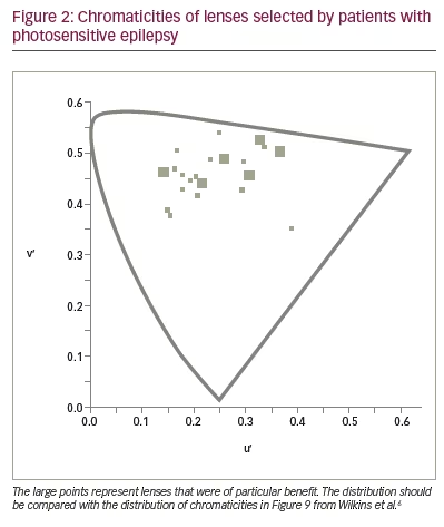
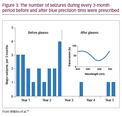
To see whether precision tints might offer symptomatic relief, Wilkins et al. examined 33 patients with photosensitive epilepsy.17 The colorimeter examination was conventional but was performed under EEG control in case of uncomfortable coloured-light-induced seizures. The EEG showed no photoparoxysmal response in any patient. Twenty-three patients (70%) reported beneficial perceptual effects of coloured light and were given precision tints to wear if they wished. The chromaticities of the tints are shown in Figure 2 and reveal that, given the choice, different individuals choose different colours. The mean transmittance of the tints was 29.9%. Seventeen of the 23 patients were contacted after an average of 2.4 years. Thirteen of the 17 (76%) were still wearing the tinted glasses and reporting reduced symptoms such as eye strain. There were reduced seizures in three patients, two of whom received changes in anti-epileptic medication during this period. One patient, however, had no change in medication over the course of 5 years, and the reduction in her major motor seizures as a result of the glasses was unequivocal (Figure 3).
Autism
There is ample clinical evidence of sensory hyper- and hyposensitivities in children with autism, although empirical evidence is limited.7 In terms of symptoms and impact on everyday life, hypersensitivity appears most problematic and can manifest as intolerance of brightness, flicker, and achromatic and chromatic contrast. A series of studies has revealed how coloured filters can reduce visual sensitivity and, thereby, improve the perception of emotion. The studies began by using the Intuitive Overlays, coloured plastic sheets suitable for placing over a page without interfering with its clarity. Later studies used the Intuitive Colorimeter system.18
In the first study, conducted by Ludlow et al., 19 school children with a diagnosis of autism spectrum disorder (ASD) (aged 8–15 years) and a control group of 19 typically developing children (matched for age and intelligence) selected an overlay of a colour that improved the clarity of text.19 Eleven of the children with ASD increased their reading speed on the Wilkins Rate of Reading Test by more than 15% (i.e. an increase greater than expected by chance).20 An increase of this size was seen in only two children in the control group. Subsequent work by Fong et al. failed to find any perceptual effect of coloured overlays in children with ASD, but their task involved reading digits arranged in a widely spaced matrix.21 It is mainly when the material to be read is closely spaced that reading becomes uncomfortable.22
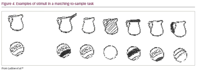
In a later study, Ludlow et al. placed overlays over a page of text and asked children to select the colours that improved the clarity of text, as before.23 The overlays were then placed over a plain sheet of paper, and the children were asked which colour they preferred. As in the earlier study, the overlays selected for clarity increased the rate of reading in the autism group but not in the control group. The overlays chosen on the basis of colour preference had no beneficial effect on reading speed in either group. The beneficial effect of the overlays was not confined to reading. The task of matching objects to samples of similar objects (Figure 4) was also improved with an overlay chosen to improve the clarity of text.
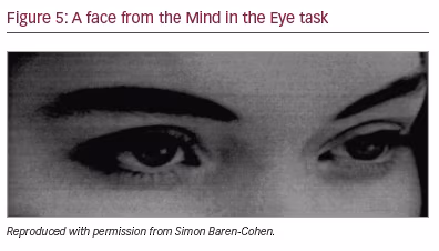
The Mind in the Eye task has been widely used to measure ‘theory of mind’ in individuals with autism.24 It presents pictures of just the eyes of a face (Figure 5) and requires the observer to make a judgement as to which of four adjectives best describes the emotion the face is expressing. Ludlow et al. administered this task to 15 children with ASD aged 8–17 years and a control group matched individually for age and sex.25 The test was given with and without overlays of a colour selected as improving the clarity of text. The children with autism performed more poorly than the typically developing children, but their performance was improved with the overlay. The extent of improvement in recognizing the emotion correlated positively with the increase in reading speed that the overlay afforded.
Whitaker et al. corroborated on and extended these findings using a task that required a holistic judgement of facial expression.26 Sixteen children with ASD were asked to judge which of two faces expressed the strongest emotion, a task that requires observation of both the eyes and the mouth. The images were presented side by side in shades of grey on a computer screen. The screen was either white or tinted a shade of colour previously chosen individually as improving the clarity of text. The discrimination was better when the screen was coloured. There were no such effects for a control group of typically developing children matched for age and intelligence.
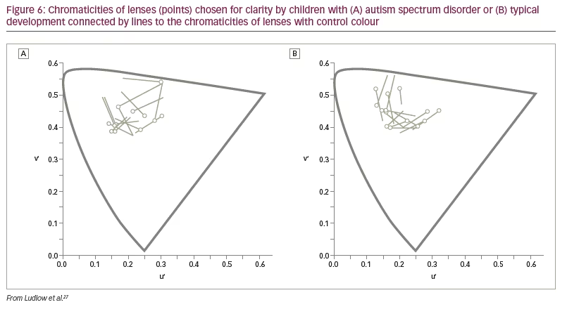
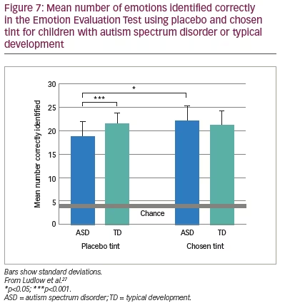
The above findings were examined in a more realistic setting by Ludlow et al. using the Emotion Evaluation Test, in which professional actors enact ambiguous scripts representing seven basic emotions: happy, surprised, sad, angry, anxious and revolted (as well as neutral, which was not used in the study).27 The video sequences are in colour and portray naturalistic, complex expressions with appropriate intonation and gestural cues. A series of statements is offered, and the viewer has to endorse or reject each. Fourteen children with ASD and 14 typically developing children matched for intelligence took part. Initially, the participants were examined with the Intuitive Colorimeter and tinted trial lenses were individually selected, matching the chosen settings (active tint). A computer algorithm was used to compute control lenses that differed from the chosen settings by 0.07 in International Commission on Illumination Uniform Chromaticity Scale chromaticity, changing hue and keeping saturation similar (Figure 6). This difference has repeatedly been shown to eliminate the beneficial effects of a selected colour.28 One month later, the children watched two versions of the Emotion Evaluation Test when wearing the active tint or the control tint in random order. The mean number of emotions correctly identified is shown in Figure 7. The tint improved performance of the children with ASD to the level of the typically developing children.
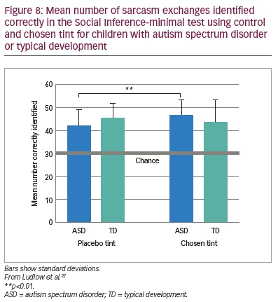
Ludlow et al. also administered the Social Inference-minimal test, in which vignettes show actors making sincere or sarcastic statements.27 Speaker demeanour (voice, facial expression) indicates the intended meaning of the exchange. In the test, participants are asked to endorse or reject statements about what a specific actor was doing, saying, thinking and feeling. The results of this study mirrored those of the Emotion Evaluation Test, as shown in Figure 8.
Although the above series of studies involved small samples, their findings tell a consistent story suggesting that coloured filters improve the visual performance of children with ASDs, in particular the recognition of facial expressions. This can have clinical significance. Ludlow and Wilkins reported the case of a 13-year-old boy who was diagnosed at the age of 4 years with ASD and attention deficit and hyperactivity disorder.29 The boy reported ‘hot eyes’ leading to headache and nausea in response to bright colours. He had a strong obsession with blue and purple colours. A good response from a purple overlay was followed by an assessment with the Intuitive Colorimeter, and blue lenses were prescribed. The periods of hot eyes, vomiting and ‘burn out’ abruptly stopped, and he was able to participate in social activities. After about a year, the glasses were broken, and, until they were repaired, the periods of ‘burn out’ returned.
In all of the studies of autism mentioned above, the optimal colour was selected on the basis of improving the perception of text, just as in earlier studies of reading difficulty reviewed elsewhere.13,30 Nevertheless, the chosen colour has been effective in improving complex perceptual tasks, including those involving the perception of faces and facial expressions, which are known to be subserved by particular cortical structures. It is possible that both text and facial expression contribute to the well-recognized sensory overload experienced by individuals with autism, which may result from a cortical hyperexcitability, given the high incidence of seizures in ASD. One of the largest studies aimed at identifying the prevalence of epilepsy in children with autism found that 26% of children with ASD aged 13 years and older were diagnosed with epilepsy.31
The studies described above have simply selected children with autism, and did not screen for particular behavioural traits or colour preference. The positive results that have been obtained would seem to indicate that precision tints may be of greater benefit in autism than in dyslexia, where no more than about 20% of individuals benefit.13
Migraine
The Intuitive Colorimeter has also been used to prescribe individual precision tints for people with migraine, both in research and as part of clinical practice. Figure 9 shows the chromaticities of light that individuals with and without migraine choose as comfortable for observing text.32,33 As can be seen, most individuals who do not have migraine choose colours of light that they would normally experience every day from daylight or electric lighting (i.e. the chromaticities they choose are close to the Planckian locus shown by the solid line; most common light sources have a chromaticity close to the Planckian locus). Individuals who experience migraine with aura, however, described very different colours as comfortable. They choose chromaticities well away from the Planckian locus. Note that optimal colour is specific to each individual, and orange is rarely chosen. This suggests that the FL41 lens referred to in the introduction may be suboptimal for reducing photophobia in most individuals.
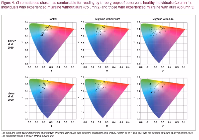
The individuals investigated by Vieira et al. (Figure 9) undertook a task in which they searched for a word in a matrix of letters.33 For the individuals with aura, the performance was 30% faster with the chosen tint than without it. There was no such effect for healthy controls or individuals who experienced migraine without aura. This work suggests that it is mainly individuals who experience visual aura who will find tints useful and that the tints may need to be individually prescribed.
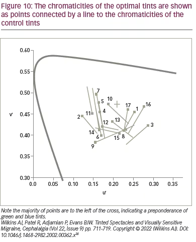
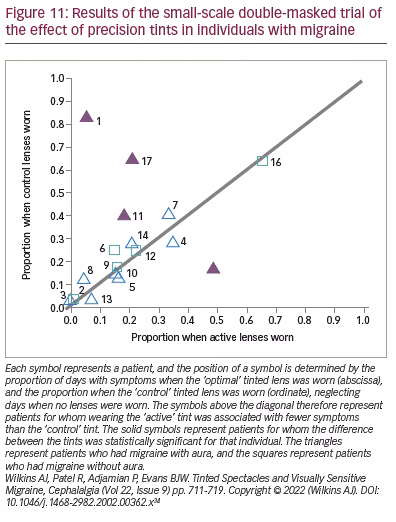
If precision tints improve visual performance, can they also reduce headache? Although there are many anecdotal reports of success, there is little scientific evidence. An early study of the effects of tints on headache incidence evaluated a mixed group of patients with migraine, with and without aura.34 In this small-scale study with double-masked crossover design, 17 patients were given a tint that either matched the colour selected in the Intuitive Colorimeter (‘optimal’ tint) or another colour (‘control’ tint) that differed in chromaticity by 0.06, selected by computer algorithm. The chromaticities of the optimal tints are shown as points in Figure 10, connected by a line to the chromaticities of the control tints.
The tints were given in random order, and each were available for 6 weeks separated by a period of 2 weeks without tints.34 The study was masked: neither participants nor researchers knew whether the tint they were wearing matched the optimal colour they had chosen some weeks before in the Intuitive Colorimeter.
For the group as a whole, there was a marginal overall reduction (p=0.02) in days with symptoms when the optimal lenses were worn relative to those when the control lenses were worn (Figure 11).34 The majority of points in this figure lie close to the diagonal line, indicating little difference between the optimal and control tints. The triangles represent the patients with aura, and the squares represent patients without aura. The four filled points are patients for whom the difference was statistically significant for that individual. These four patients all experienced migraine with aura. Three of the four experienced fewer symptoms, and one did better with the control tint, possibly because of the effects of order. Evidently, it may be a minority of patients with aura whose headaches are reduced with tints. This study did not include a grey control group or a no-intervention group, and no pre-intervention baseline was available for the patients who participated. As will be seen in the next section, for tints to be effective, patients may need to be selected on the basis of the photophobia they experience.
Cluster headache
Cluster headaches are excruciatingly painful and occur in bouts of frequent attacks, known as cluster periods. The pain is usually unilateral and behind or around one eye. The headaches are often preceded by a prodrome with symptoms warning of an imminent headache. Wilkins and Cooper reported the case of a patient with cluster headache who was examined with the Intuitive Colorimeter and given precision tints on a trial basis.35 He wore the tints only during his prodrome and discovered that the prodrome did not then progress to headache. He has been free of cluster headaches for 6 years and has brought innumerable prodromes to an end by wearing his tinted glasses. Most patients with cluster headaches are photophobic during the prodrome, and this case suggests that, by treating the photophobia, it may be possible to prevent a cluster period. Although this study describes only one patient, a second patient has now reported prodromes that remit with tints and has avoided an expected cluster. Evidently, a systematic trial is warranted for this debilitating condition.
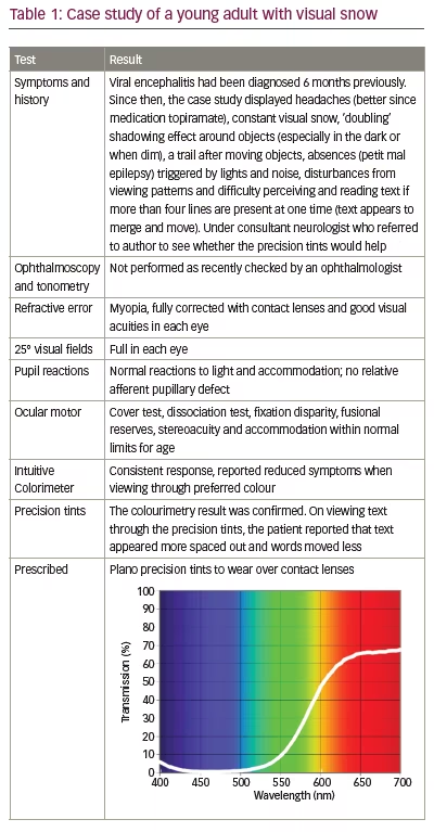
Visual snow
Visual snow is a recently defined clinical syndrome.36,37 The condition had previously appeared in the literature in association with recreational drug use and, independently, as a form of ‘persistent migraine aura’.38,39 Patients report continuous ‘grainy’, ‘dotty’ or ‘pixelated’ visual disturbance affecting the entire visual field of both eyes equally. Patients may also complain of persistent ‘after images’, which are unusual because they are positive (i.e. do not appear as complementary to the original stimulus in colour or luminance). This is concordant with another symptom, that of seeing ‘comet tails’, also positive, following the path of moving objects. The pixelated vision may be unremitting or may be modulated by the visual scene, for example, its brightness. Many other observations made by the patients are established as normal entoptic phenomena. Examples of these are the ‘blue-field entoptic phenomenon’ due to awareness of the movement of white blood cells in the retinal capillaries, starbursts around light sources and jumping of text when reading. These may not be readily noticed throughout the human life span.
Patients may experience one or more of these phenomena in various combinations. Indeed, not all of them complain of visual snow, although this has become the defining terminology of the syndrome. Symptoms may be life-long or acquired, and it occurs most frequently in young adults, occasionally following illness.
The patients also often describe an instability of text when reading, leading to the suggestion that cortical hyperexcitability34 or abnormal filtering at the thalamic level may be implicated in the disorder.33 Often, precision tints reduce the symptoms,33,40 and in the authors’ experience, these are particularly effective when the symptoms are modulated by the visual scene upon which they appear. Table 1 is a case of visual snow seen by one of the authors.
Stroke
After a stroke, visual dysfunction is the norm rather than the exception, occurring in more than half of patients.41,42 Needless to say, these problems are multifactorial, ranging from diplopia due to ophthalmoplegia to hemianopia from occipital stroke. Three papers have investigated the possible effects of precision tints in patients with stroke. The first showed that these patients are particularly susceptible to pattern glare (perceptual distortions and discomfort from patterns, thought to indicate cortical hyperexcitability).43 The second study compared 17 patients with stroke with 17 age-matched controls.44 The study showed that precision tints can increase reading speed and accuracy, both in the short and long term. The third publication is a case report of a woman whose symptoms remitted with precision tints but then recurred following a second stroke.45 A revision of the tint was then successful in treating her symptoms.
Multiple sclerosis
The visual pathway is almost universally affected in multiple sclerosis, particularly the optic nerves and the control of eye movements. In a patient with multiple sclerosis and symptoms of dizziness, Yadav and Quan compared brown, grey and yellow lenses.46 With the yellow lenses, the symptoms remitted, and visually evoked potentials increased in amplitude. No studies of precision tints in patients with multiple sclerosis have yet been undertaken, although Newman Wright et al. investigated the effects of individually coloured overlays on reading and visual search.47 With an overlay of a colour chosen for textual clarity, 25/26 patients reported fewer symptoms of visual stress, 50% read at least 20% more quickly and 50% omitted at least 57% fewer targets during visual search. Subsequently, 13 randomly selected patients were given grey overlays, while the remaining 13 sex- and age-matched patients were each given an overlay of their individually selected colour. Patients were permitted to use their overlays as and when they wished during the next 2 weeks. The reading and visual search performance of those patients who had received a grey overlay did not change, whereas the performance of those who received an overlay of their selected colour improved, both when using the overlays and when not using them. The 13 patients who initially received a grey overlay were then each given an overlay of their selected colour, and their performance subsequently improved.
Head injury
Headache and photophobia are very common following concussion,48 and many patients attempt to control their photophobia with dark glasses. Jackowski et al. reported improved letter contrast sensitivity and reading rate with Corning photochromic lenses (Corning Inc., Corning, NY, USA).49 In 39 patients with concussion and visual disturbances, Clark et al. used a large range of lenses of different colours. Most patients reported that a coloured lens (most commonly blue or green) provided relief.50 None of the patients reported relief with yellow lenses. In three patients with photophobia, none of the coloured lenses provided a benefit. Fimreite et al. used the Intuitive Colorimeter and compared the individually selected tints it provided with red, blue and grey lenses in a sample of 12 patients with concussion.51 Patients reported symptom relief, but there was little consistency in their choice of colour, and no effect of the filters on visual evoked potential amplitude or on the duration and number of fixations or regressions during reading.
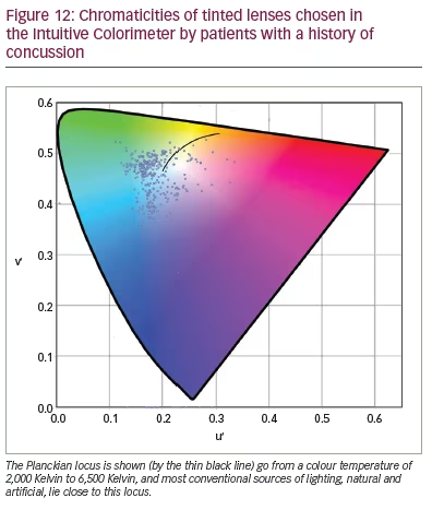
In a larger study of patients with concussion, Monet et al. (personal communication) examined 112 male and 253 female participants aged 7–82 years over the course of their work for the Canadian company Opticalm. The clients were seen an average of 2 years after injury (range: 13 days – 26 years); 94% of them complained of headache and photophobia, and 74% of reading difficulty. They were assessed with the Intuitive Colorimeter, and the chromaticities of the tints are shown in Figure 12. In agreement with the findings of Clark et al.,50 most tints were green or blue, and most lay away from the chromaticities of conventional lighting, whether daylight or artificial (as shown by the distance from the Planckian locus, the solid line in Figure 12). Half the patients needed a dark-coloured lens to control their photophobia, which was achieved by adding a grey dye to the two coloured dyes that usually comprise a precision tint. On the Wilkins Rate of Reading Test, the reading rate increased by an average of 29% with the tint, and, in 170 clients (57%), the increase was more than 15% (i.e. greater than the normal variation).20 Eighty-eight clients were seen on two occasions, with an interval of 53 days – 3 years 10 months between assessments. The average difference in chromaticity between the two assessments was 0.043, a difference that was similar to that obtained by Aldrich et al. when two colorimetry assessments of people with visual stress were undertaken in immediate succession.28 The average transmission of the tint increased from 38% at first examination to 42% in the second due to a reduction in the grey dye needed.
Discussion
Clinical implications
In certain instances, the clinical effects of filters can be dramatic, as in the case of the patient with photosensitive epilepsy whose seizures were reduced, the patient with ASD who was able to socialize and the patient whose cluster headaches were prevented. Dramatic as these individual cases may be, coloured filters often have little clinical benefit. Predicting the likely clinical outcome will be important in future work.
Neurophysiological mechanisms
The visual system evolved to process scenes from nature. In natural scenes, colour differences are limited, whereas, in the urban environment, scenes have an unnaturally large variation in colour. In a recent study by Penacchio et al., students were asked to rate the visual discomfort they experienced from images of contemporary art.52 The images that were particularly colourful were rated as more uncomfortable to look at. A simple metric (difference in chromaticity between neighbouring pixels averaged over the entire image) explained 28% of the variance in judgements of discomfort. When works of art were more colourful than images from nature, they were rated as uncomfortable. These findings suggest that vision becomes uncomfortable when there are large and unnatural local differences in colour in a visual scene. Tinted lenses bias the chromaticities in a scene, but they also reduce the differences in chromaticity. Perhaps, this is one mechanism for the reduction in discomfort that various tints can provide.
Reduction in chromaticity differences cannot be the entire explanation, however, because different individuals choose different colours of lighting and different colours of tints as comfortable, and their individual choices are reliable.28 In addition, these choices are made when observing text, and text varies in luminance rather than chromaticity. One possible mechanism for the individual differences concerns long-term adaptation to electric lighting. As already mentioned, legacy fluorescent lighting can vary continually in both illuminance and chromaticity at 100 Hz or 120 Hz, well within the temporal resolution of retinal cells,53 and this variation is known to cause headache and photophobia. It is likely that adaptation occurs in response to the colour variation from electric lighting, and this may have consequences for colour preference in relation to photophobia.
In some of the disorders reviewed here, a hyperexcitability of the cortex has been demonstrated directly in neuroimaging studies. In migraine, for example, the response to patterns gives an abnormally large blood oxygen level-dependent response on functional magnetic resonance imaging.54 The response is reduced with coloured filters individually selected as comfortable for reading but not with those that differ in chromaticity by 0.06.55 Hyperexcitability is the basis of one of the leading biological theories on autism56 and has been proposed as a mechanism in visual snow.57,58 Three of the remaining disorders covered in this review, stroke, multiple sclerosis and head injury, are comorbid with epilepsy. It is, therefore, possible that the filters reduce the effects of cortical hyperexcitability in all the disorders reviewed.
The possible mechanisms listed above are not mutually exclusive. The differences in the chromaticities in an image have been shown to be closely related to the magnitude of the cortical response, both haemodynamic59 and electrical,60 so it might be expected that coloured lenses would reduce the cortical response to visual stimulation. Long-term exposure to 100 Hz flicker from fluorescent lighting is known to cause headaches and eye strain,4 and the visual system is known to show long-term adaptation to colour.61 All of these factors might exacerbate a susceptibility resulting from cortical hyperexcitability.
There is no reason to think that, when the visual cortex is hyperexcitable, the excitability is uniform throughout the visual cortex. It is more likely that, in susceptible individuals, there are patches of cortical hyperexcitability. For example, some patients with pattern-sensitive epilepsy are sensitive only to a limited range of pattern orientations, suggesting that the hyperexcitability involves only a few cortical orientation columns.62 As units have been found in several areas of the visual cortex that respond to specific colours,63 such a patchy hyperexcitability could explain the benefit from individually prescribed colours and why they sometimes need to be prescribed with precision.
Differences in the chosen colour
The greater frequency of tints on the left-hand side of the chromaticity diagram in Figure 12 is obvious. There are more than four times the number of patients with a u’ chromaticity that is less than that of equal energy white (0.21) than with a chromaticity greater than 0.21. In the patients with migraine in the three studies by Aldrich et al., Vieira et al. and Wilkins et al. described above, the ratio of individuals with u’ chromaticity less than 0.21 is an average of 1.27 times larger than those with a u’ chromaticity greater than 0.21.32–34 In the patients with ASD in the study by Ludlow et al. (Figure 6), the ratio is 1.75.27 The samples are small, and the ratios cannot be estimated with precision. Nevertheless, in the aggregated control groups, the ratio is close to 1. By way of contrast, in patients with photosensitive epilepsy, the ratio is slightly less than 1.17 Eventually, with larger groups, some consistent trends in colour choice may emerge, dependent on the diagnosis.
Limitations
In this review, coloured filters have been described in terms of their chromaticity. There is a one-to-one link between chromaticity and the relative energy captured by the three classes of cone. There are, however, other photoreceptors in the eye: the rods and the ipRGCs. All three classes of photoreceptors, ipRGCs,7 rods64 and cones,8 have been variously linked to photophobia. It seems likely that all photoreceptors have a part to play,1,65 and this might mean that a more nuanced description than chromaticity will ultimately be needed.
Conclusion
The use of coloured filters chosen individually for optimum comfort and clarity was reviewed. In photosensitive epilepsy, autism, migraine, cluster headache, visual snow, stroke, multiple sclerosis and concussion, the filters appear to reduce photophobia and its effects on visual perception, offering clinical benefit. In some patients, the benefit appears profound. The evidence is preliminary but promising.